Bluethumb Gets A Facelift
Have you been to our homepage today? It looks a little different… Our development team has been busy building a more personalised homepage with simpler navigation. The whole effect is not only cleaner and easier to use, but also gives us room to showcase more artists. It’s mobile friendly too with big buttons to match clumsy (blue) thumbs!

Our new homepage.
“One of the main objectives of our homepage redesign was to more effectively feature artists on our platform,” explains Melissa Cooper, Head of Product and User Experience. “We recently redesigned the homepage sliders at the top of the page for the same reason and saw an increase in traffic and sales for the artists featured. Building on this success, we’ve created more of these opportunities for a greater number of artists each day. “
Below is a breakdown of each change and how it improves the Bluethumb experience.
The Navigation
Our navigation bar was a little confusing so we’ve changed it up to make what you’re looking for much easier to find.
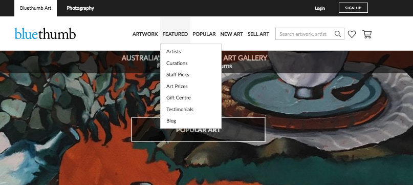
The old navigation, which has become outdated and confusing as Bluethumb grows.
We’ve brought our artists to the forefront with a place in the main menu where they can be found by popularity, new or featured.
The new artworks tab uses insights from our data analysis to display artworks according to category, popular, staff picks or just sold. After discovering our collector’s rarely use the medium options to search, we’ve removed it from the navigation but it’s still in the filters.
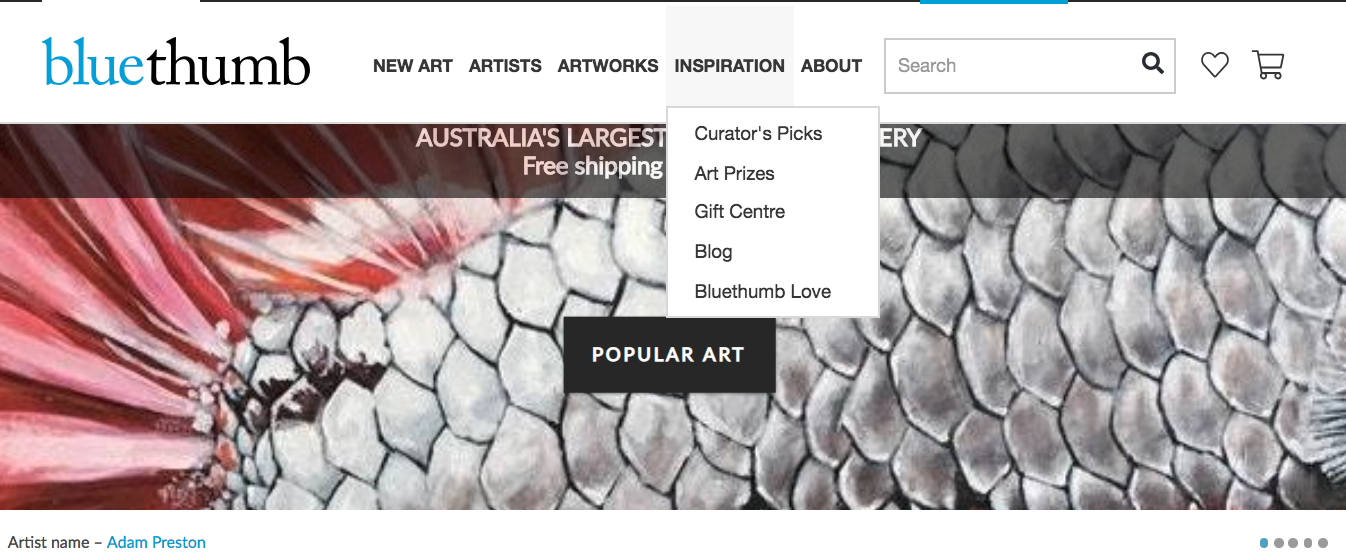
So simple. So fresh. And so easy to use.
The Inspiration tab (pictured above) is brand new and now home to our blog, testimonials, art prizes, gift centre and curator picks. This tab is aimed to help collectors who come to the site with nothing specific in mind, especially new collectors.

The new navigation is designed to make Bluethumb even easier to use.
“An important role of any homepage design is to do a better job of providing a high quality starting point for people who visit a site,” says Melissa. “Discovering new artists is a great way to do this, as is highlighting our curations and hand picked collections. We have done a lot of research into what our collectors are looking for and we will continue to invent and design ways for them to get there quickly.“
New Feature: Daily Picks
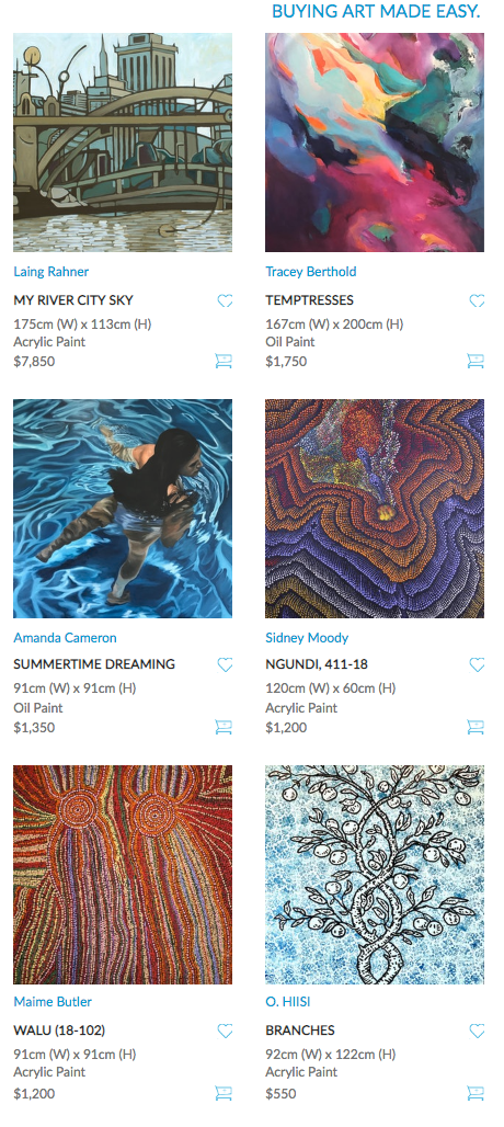
The new Daily Picks display – 6 fresh new artworks being showcased each day.
Every day we’ll show you 6 new artworks that we think you’ll love. These picks are selected by our curatorial team and based on their expertise and what our data tells us. We’re excited to use this feature to showcase more new artists.
New Feature: Highlight Buttons
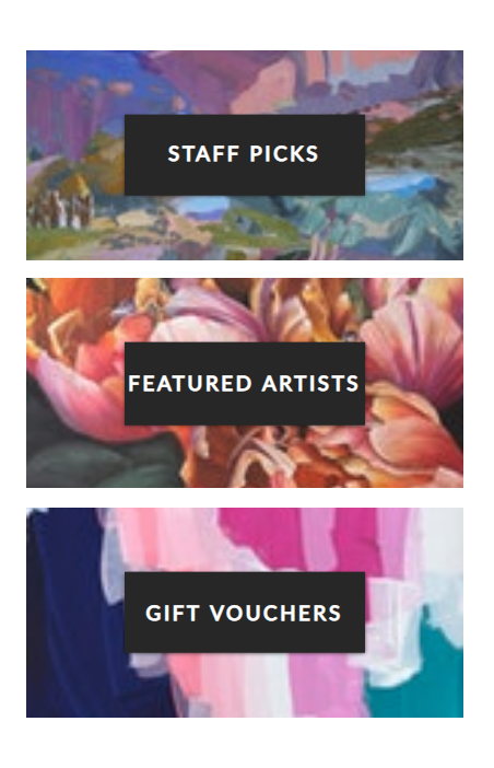
The new highlight buttons give quick access to our most popular pages.
To the right of the daily picks are three buttons we can customise whenever we like to direct our collectors to popular hotspots on Bluethumb. Now you’ll never miss out.
Increased Visibility: Recently Viewed

it’s easy to find what you’ve recently been looking at!
One piece of feedback we hear often is collectors struggling to find an artwork they’ve looked at previously. To make things easier you can now see the last 6 artworks you’ve looked at right on the homepage. There’s also a link to all your favourites, so you’ll never lose an artwork again.
Increased Visibility: Just Sold
We’ve increased the visibility of the recently sold artworks. One of our most popular pages, it’s now easier than ever to see what other collectors love. We now showcase the last 3 recently sold pieces right on the homepage. That’s 3 times as much eye candy.
New Feature: Collections
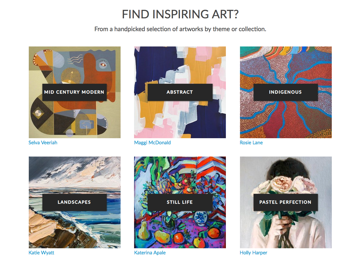
Another tool to make navigating the website quick and easy – browse collections by category or theme.
Have a specific theme or category in mind? Look no further – at the click of a button you can access a range of categories, curations and themed inspiration. This section also allows us to showcase our artists with customisable button backgrounds. Collections is the place to go for trends, themes and top picks.
New Feature: Bluethumb Is for Everyone
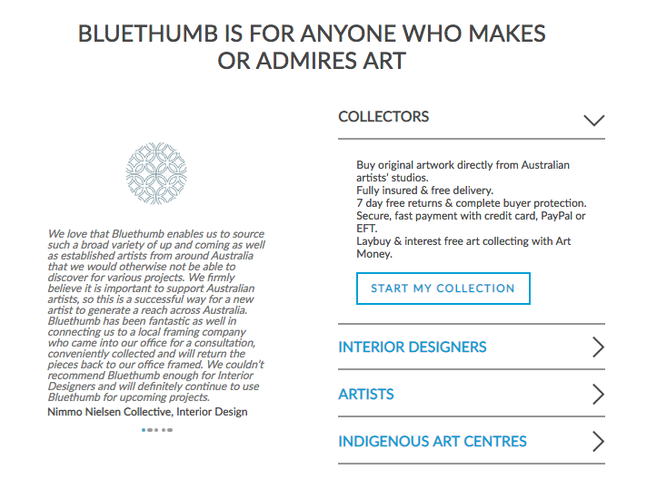
A place to hear from all the different users of Bluethumb.
Here we’re speaking directly to all the different types of users on Bluethumb. “We wanted to highlight all of the great reasons to be a part of the Bluethumb family,” explains Melissa. “Whether you’re an artist, collector, gallery or interior designer, we continue to build experiences and develop services to make artwork accessible to enjoy and to collect.”
Click here to explore the new Bluethumb homepage.





I am exited to see all the changes to this amazing platform! It’s a great development. You guys do an amazing job!
Loving the new profiles, very cool.