Your New Bluethumb Artist Profile!
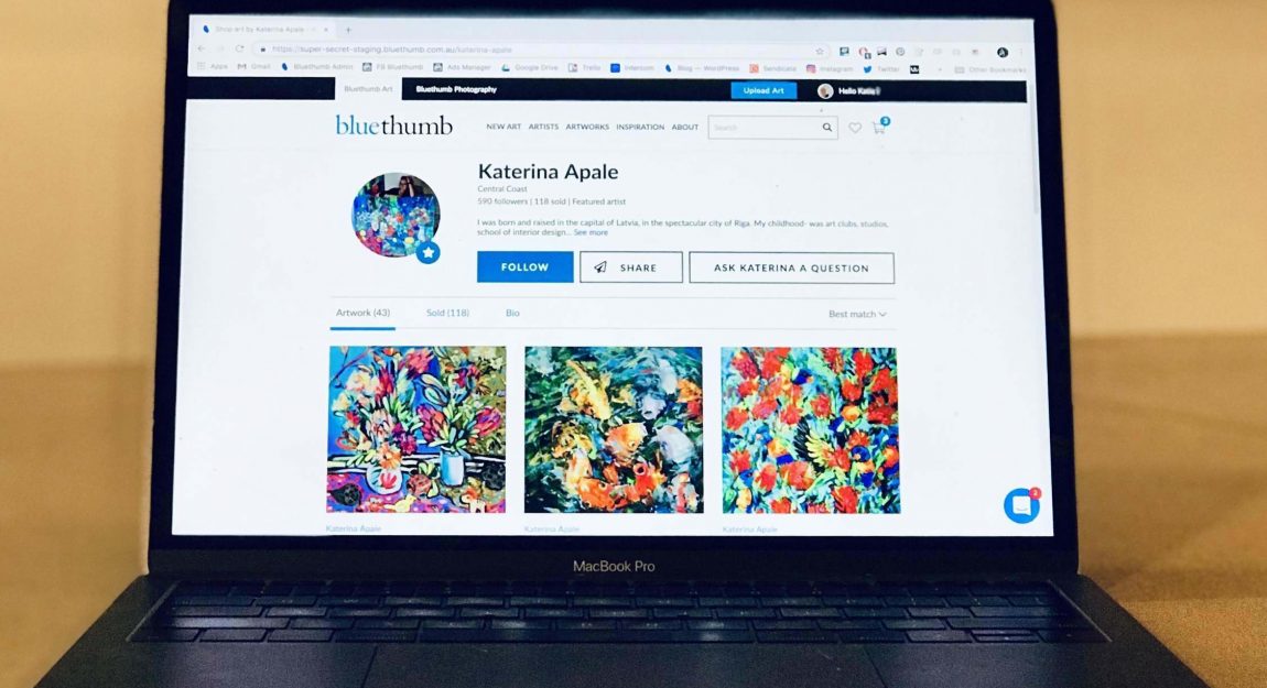
As a Bluethumb artist, we believe that you should be equipped with the best tools both on the canvas and on your selling platform. You’ve given us at Bluethumb some stellar suggestions and feedback over the past few months as to how we can improve our service to you. We listened and worked hard to bring you your new and updated Bluethumb artist profile!
This new interface is designed to help you make the most out of your profile, accentuate your artwork and present your information in a clear, effective way to collectors.
Ready to get started? Let Sheeraz walk you through the new profile in our short video guide below!
With all new features, your Bluethumb profile is designed to show you in your best light to collectors. What’s more, there are better organisation tools than ever before, making it easier to browse your profile and let your artwork get the attention it deserves. For more on this, check our FAQs here.
As are the best things in life, this profile is free, and is available for all artists.


The video has not turned up on my tablet.
Hey Merril, perhaps it’s not compatible. Have you tried watching it on your computer or phone?
I forgot to say, the actual pic of the new format looks good.
Great job guys. It looks great! I can’t wait to explore…. well done BT….it looks beautiful.
?❤
I really like the new website although the profile photo doesn’t really allow for any artwork background to be included. The new layout of artworks is great as are the Prize and Exhibition listings and Curator’s Picks section.
Just a small correction – the apostrophe should be removed from ‘Picks’ and placed in Curator’s 🙂
Thanks for picking that up Marian – our team are onto it asap! 🙂
Can’t help myself – it’s my editing background ?
Great job Bluethumb,as always maintaining your high standard.
Cheers
Maria Cross
Great work guys. Had trouble getting the video to play all the way through but have got the gist and will get onto updating my profile asap. Thanks for continuing to improve all our artistic lives 🙂
Thanks BT Team!
It all looks really great. Love the new image sizing.
I’m looking forward to updating my info 🙂
Really like the new profiles very neat, no unnecessary stuff. You guys are all over this.
I forgot to ask about the number of additional images we can post per listing. I’d like to able to post a few more, show the back of the canvas & add another generated Insitu image of my own photoshopping. Also being able to post short vids would be very cool, for those of us that don’t have a YouTube channel. I heard that mentioned on a webinar. I’m not sure how that might fit into the new neat profiles. Just some thoughts.
Hi Scott,
With the new profile, you can have up to three additional images. We usually recommended that an artist provides one in-situ image, one detailed image of the canvas, and one that includes the canvas edges. Hope this helps!
Hi Grace, I was talking about increasing thee number of additional images. Thanks anyway.
Right now it isn’t possible to increase the number of additional images, Scott, but we are working on the feature for the near future 🙂
That’s great, i guess as for video we can upload to YouTube and share the link in the space provided. That would be much neater, the profiles really do look great, don’t want to mess that up.
Thanks
Scott
Amazing! Thanks for the update guys. Looks good!
looking forward to working with Blue Thumb as a new Artist