Why You Should Re-Think Bare Walls
Do you remember the first significant artwork you put on your wall? Perhaps it was a framed print or a favourite poster. The first artwork I ever chose for myself when I started working was The Lady of Shalott by John William Waterhouse. I was enamoured of Pre-Raphaelite paintings. Even still the bohemian qualities of that very famous painting draw me in.

The Lady of Shalott 1888 by John William Waterhouse. Source: Tate.
Placing art on walls is a very personal statement. From childhood bedrooms and your first share house to buying your first home, there is something deeply satisfying about making a statement with wall art. Yet this is often the most over-looked element of decorating a home. When everything else has been chosen, a bare wall can make a room appear unfinished.
Minimalist décor notwithstanding, a room needs space to breathe and the eye needs a place to rest. However, from a single artwork to a wall of eclectic images the beauty of artful arrangements cannot be under-estimated.
A bare wall is a unique space where you can be highly personal and reveal your true personality. Moreover, the great thing about buying a piece of art is that you can virtually do no wrong. If you love it, display it.
In interior design, many elements of the room are considered – the natural light sources, the balance of the space, views from the windows, airflow and control, the spread of sound, etc. Furniture and accessories are chosen based on purpose, floor traffic, noise control, colour, texture, durability, size, etc. Yet the same restrictions don’t necessarily apply to artworks.
Artworks can be big or small, quirky or traditional, abstract or photography, a single piece or a collage of many. If you like the artwork then you’ll be happy having it on your wall.
Having said that, balancing the size of the artwork with the size of the wall will provide a better design result. Similarly, choosing colours and topics that suit the overall room décor will be more cohesive.
Now the fun starts. OK… say you have a guest bedroom decorated in calming colours of pale blue. The options for artwork are endless – flowers, birds, sea, abstract, water-colour, oil, mixed media, pen and ink, charcoal, etc.
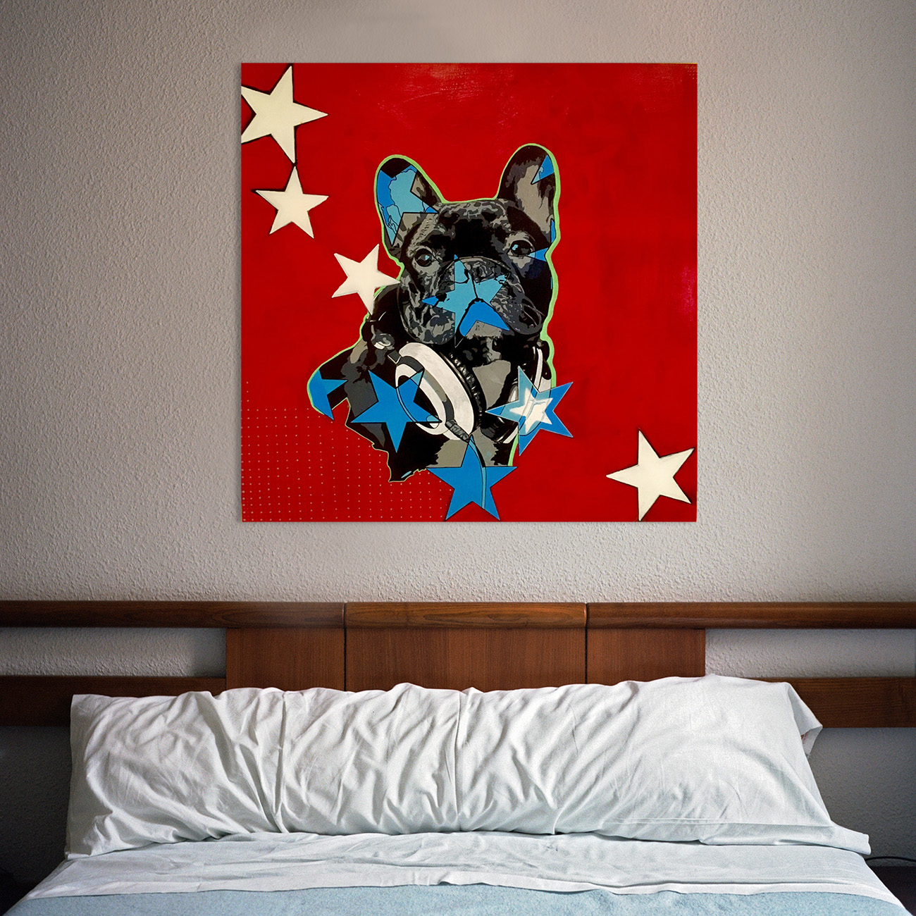
This piece really changes the room! Frenchie by Simon McCullogh.
By choosing just one of these very different original artworks, your pale blue guest bedroom will have three different personalities. I searched for ‘blue’ on Bluethumb with many and varied options being returned in the search. Simply choose the artwork you like. It’s that easy.
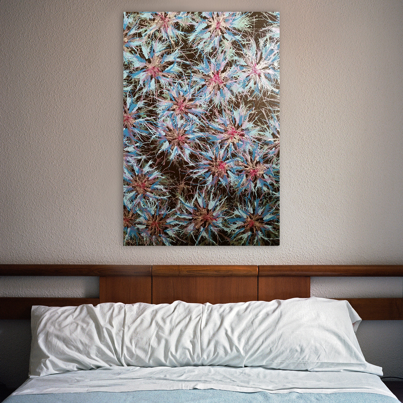
Blooms (Blue) by Jan Naylor.
Yes, choosing a single artwork is relatively easy. Choosing artworks for a collage is harder… or is it? Many artists on Bluethumb have artworks in a series.
Darlene has a beautiful and delicate series of botanical flowers including irises, cherry blossoms, roses and moth orchids. I would create a triptych of three for a home office, dressing room, leading up stairs or in a kitchen/dining room.
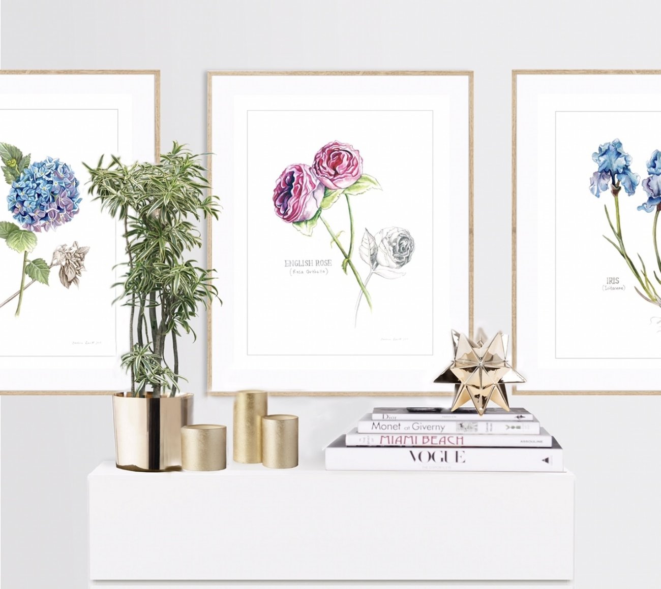
Botanical Collection by Darlene Lavett.
Then there is a wall of different images. When collating many different artworks for a large collage, create cohesion by using, say, all white picture frames (or all black, or gold, or timber, or red… whatever is common to all frames). They can be different sized frames just keep them of the same material or colour.
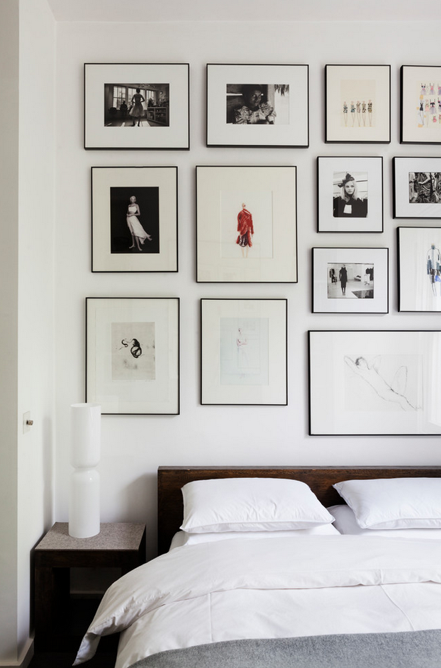
A minimal gallery wall. Source: Bertolini Architects,
Another easy way to collate different artworks on a wall is to use a picture ledge. This is easier than hanging each artwork and enables you to change pictures to suit your mood.
Given the bottom of each art work is positioned on the ledge, pictures can be of different sizes. The cohesive component is the consistent level of the bottom of each frame.
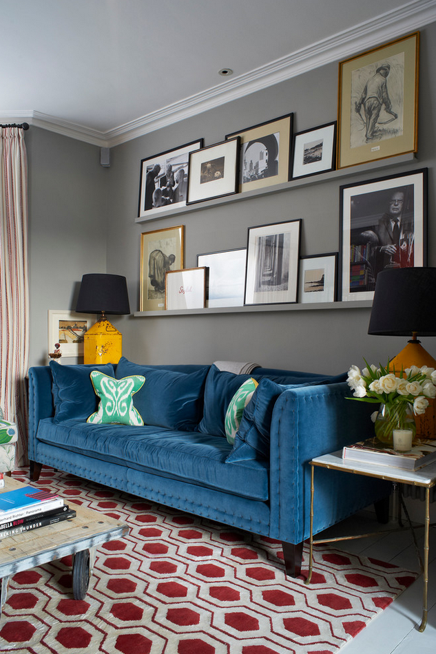
A cosy gallery wall tied together with some simple shelves. Source: Turner Pocock.
These are just a few ways you can easily incorporate art into your home. If you have bare walls and are having trouble deciding on wall art, then try one or more of these tips. Be brave. If you love it, it can’t be wrong.
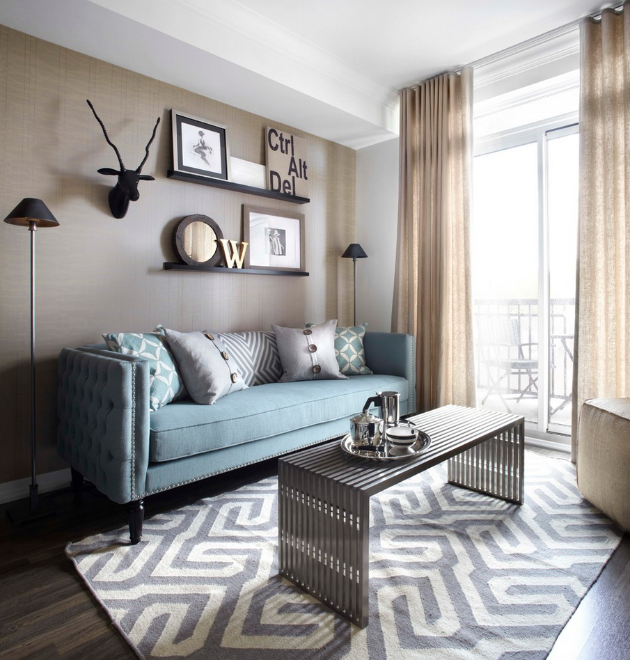
Another example of a gallery wall done right. Source: Lux Design.
These are just a few ways you can easily incorporate art into your home. If you have bare walls and are having trouble deciding on wall art, then try one or more of these tips. Be brave. If you love it, it can’t be wrong.
About the author:
Penelope always had lots of fun rearranging furniture in the house where she grew up. Seeing how different a room could look just by changing things around was a source of constant fascination.
She has always been interested in interior design, architecture, colour and texture. Now she gets to play around not only with her home but the homes of her varied clients. Who knew work could be so much fun? At Plush Design Interiors, she has the soul of a renegade designing beautiful and functional spaces. Visit Penelope at plushdesigninteriors.com.au or join her on Houzz, Instagram or Pinterest.




I totally agree, your suggestion of creating cohesion within a collection of work is key and something l try to adhere to in my own home, especially with a lot of art, it’s the only way to go.