How we got our 4 week old app featured in the App Store
We released our art iPhone app, bluethumb – art unearthed, in November 2013. In software development terms it was very much a ‘minimum viable product’. It was missing some pretty key things; art search, filter by size, art collections, artists’ upload. But what we had in there worked, and the user interface was clean, easy to use, and makes use of iOS7 design guidelines well, like edge to edge images.
[hr_invisible]
[hr_invisible]
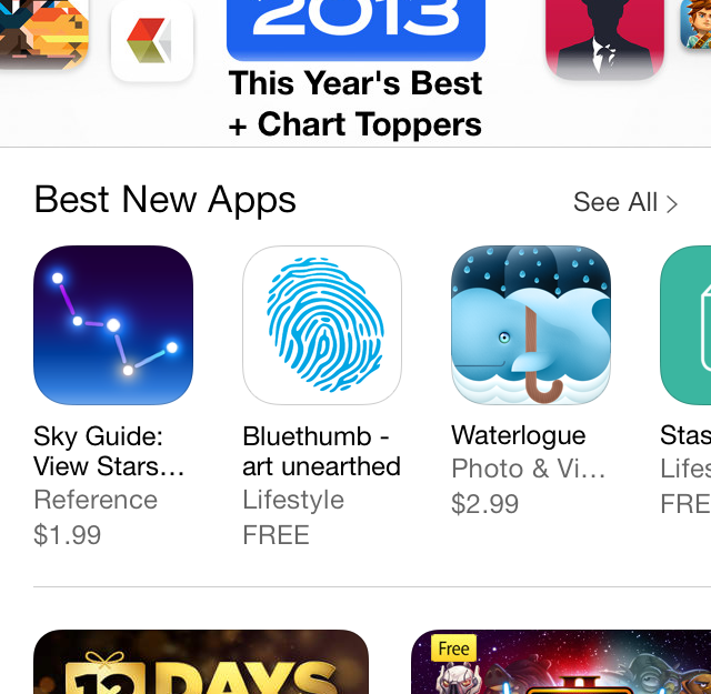
So as a small art company with no direct channels to Apple, the last thing we expected to see on Friday 4 weeks later was this.
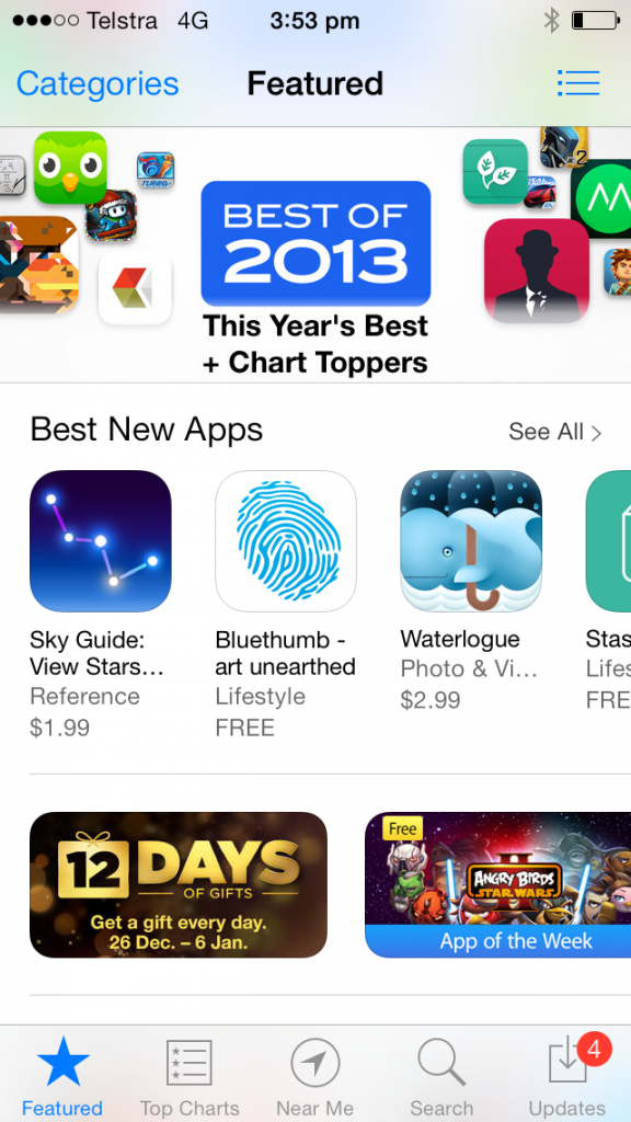
No way were we expecting this, the app didn’t even have search yet! Thankfully by Monday our updated version of the app, which contained search, was made live. There are still lots of features to add and bugs to squash.
[hr_invisible]
Why did Apple feature it? My guess is as good as yours, but I like to think because it’s an original idea, executed well.
[hr_invisible]
The idea is an open market place for visual art on iPhone, which puts artists directly in front of art collectors.
[hr_invisible]
The execution I’ll talk about in Part 2 of this blog.
What being on the app store front page has done for us
For the first 4 weeks, before we were featured, we had about about 4 downloads a day, based on our existing website users finding out about it through bluethumb.com.au.
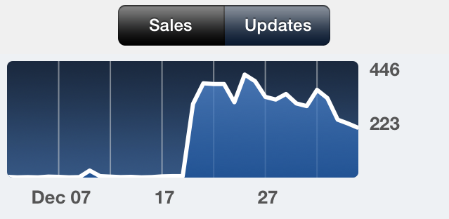
App downloads jumped to about 350 a day since it’s been on the app store front page, and we’ve now had more that 6000 downloads, and a lot of great feedback. More data is being used through the app than our website already, and art sales through the app are have been good, which is great for us and great for our artists.
Next blog will be Part 2, discussing the execution of it; how we got to our MVP, design, development and how we tried to spread the word.

