Our new Bluethumb Logo

Today is an exciting day, we launched our new Bluethumb logo!
We had always planned to update our logo when we relaunched our website late last year, but as the launch date grew close we realised we hadn’t landed on a new logo that matched the modern, refined look of the site.
So we delayed the logo change until we had found a logo that spoke to us like the updated design of our site and updated apps had.
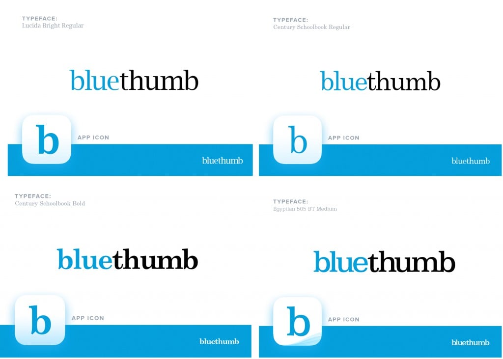
We’ve selected a minimal design coupled with a serif font, with our ‘bluethumb’ blue. As with the site’s design, we want the ‘design’ to take a back seat to our art. So we simplified down to two elements: a memorable font, and our key colour. We particularly liked the serif font as it’s accessible, authentic and implies quality. Exactly the values we hold dear as Australia’s biggest authentic art marketplace. Below are a few iterations we went through before we landed on our final logo.

We hope you love it as much as we do. Happy art browsing,
George


