Hallway Wall Art: Spruce the Oft-Forgotten Space
Not quite a room and more of a transitional space, it’s easy to see why a hallway doesn’t get much attention. Often the first part of the home that our guests encounter, this space is the first impression of your home. It’s time we changed things up and gave our hallways a spruce, from choosing hallway wall art to adding sculptural elements. Read our 5 tips below on how to style your foyer or corridor with fabulous flair.
1. Choose hallway wall art that mirrors the shape of the space
Match the proportions of the room with a statement artwork to greet guests as soon as they walk in the door. This is the fastest way to add a little personality into your home and will instantly let your friends know exactly whose home they’ve stepped into. Mirror a long, narrow hallway with and equally long, narrow artwork. Choosing an artwork to match will make the space feel proportionate and let the edges of the canvas will propel you into the next room.
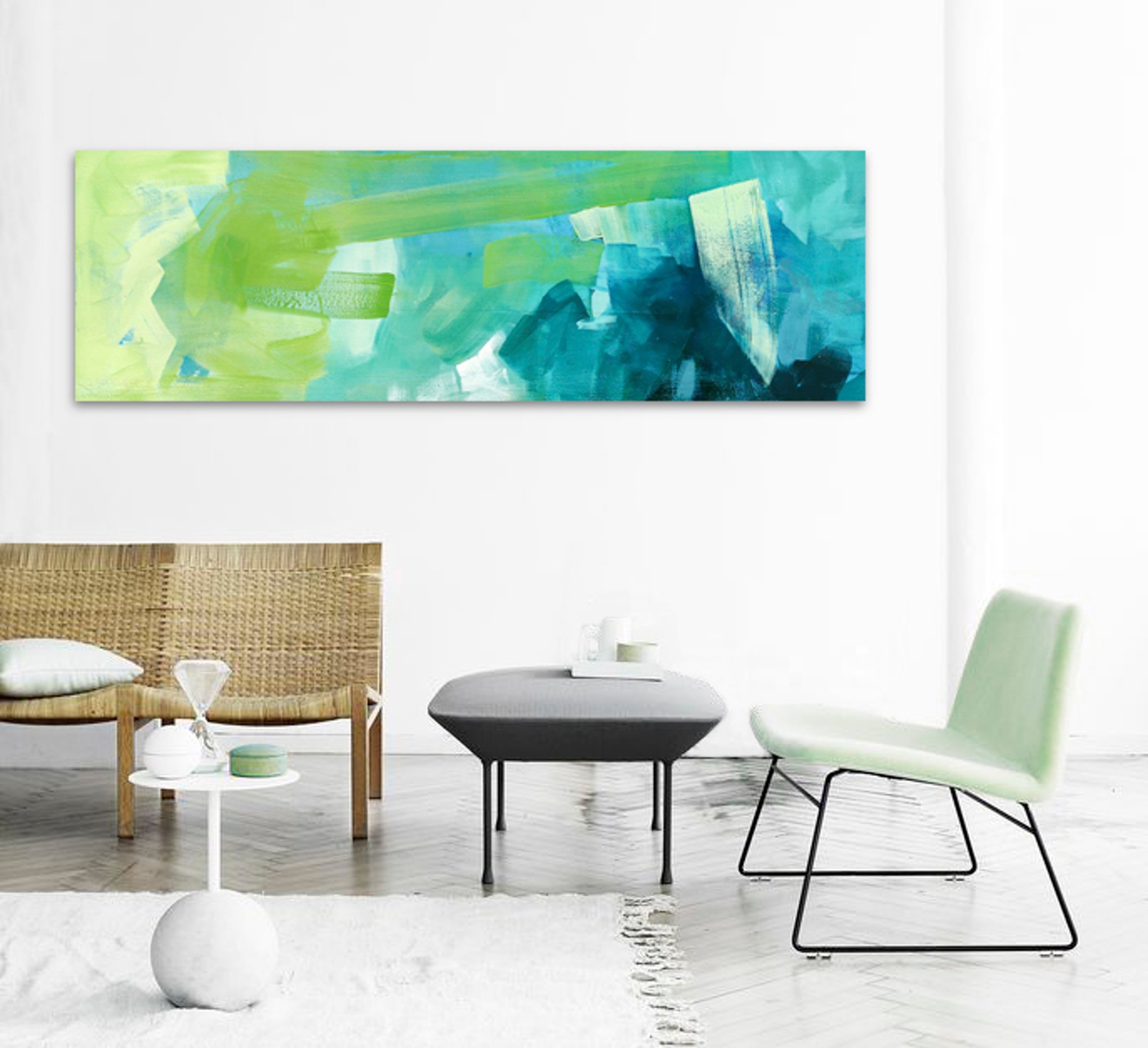
Hans by Stephanie Laine is the perfect shape to fit a long, narrow hallway.
2. Place a mirror opposite the artwork to double the depth
Make a tight space wider with a mirror – you’ll get two artworks for the price of one! Again, matching the proportions of the space will create a sense of balance to the space. Pair the mirror with a bright, white colour scheme and you’ll forget how small the hallway really is. Using white tones will reflect light around the space and fill in shadows, which will really allow your artwork to stand out.
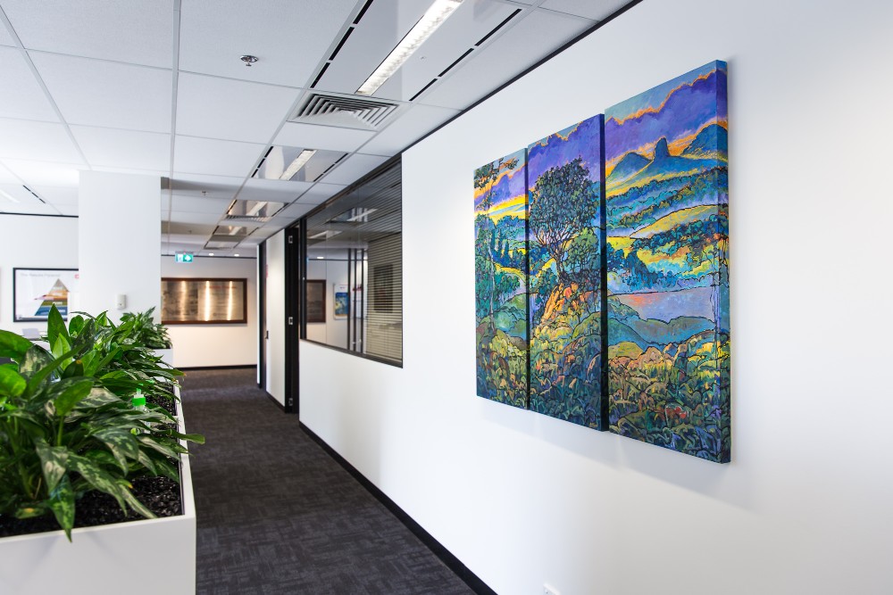
White paint will bounce the light around, making a narrow space feel bigger and brighter! Purple Dawn by Wayne Smith hanging in the corridor of one of our trade clients.
3. Add touches of style with tables and shelves
If your hallway allows for you to include a narrow shelf or console without impeding the flow of traffic, then this is a great way to give the space a personality. Of course, you want to avoid clutter – so if there’s no room for a piece of furniture, instead style a narrow shelf with some accoutrements and knick knacks for a handy space-saving style.
Decorate this additional surface with a small mirror, vase or sculptural elements. For extra style points, match the colour scheme of your vignette with the artwork you’ve hung already. If your hallway wall art is the star of the show, these smaller items are it’s back-up dancers and should match accordingly.
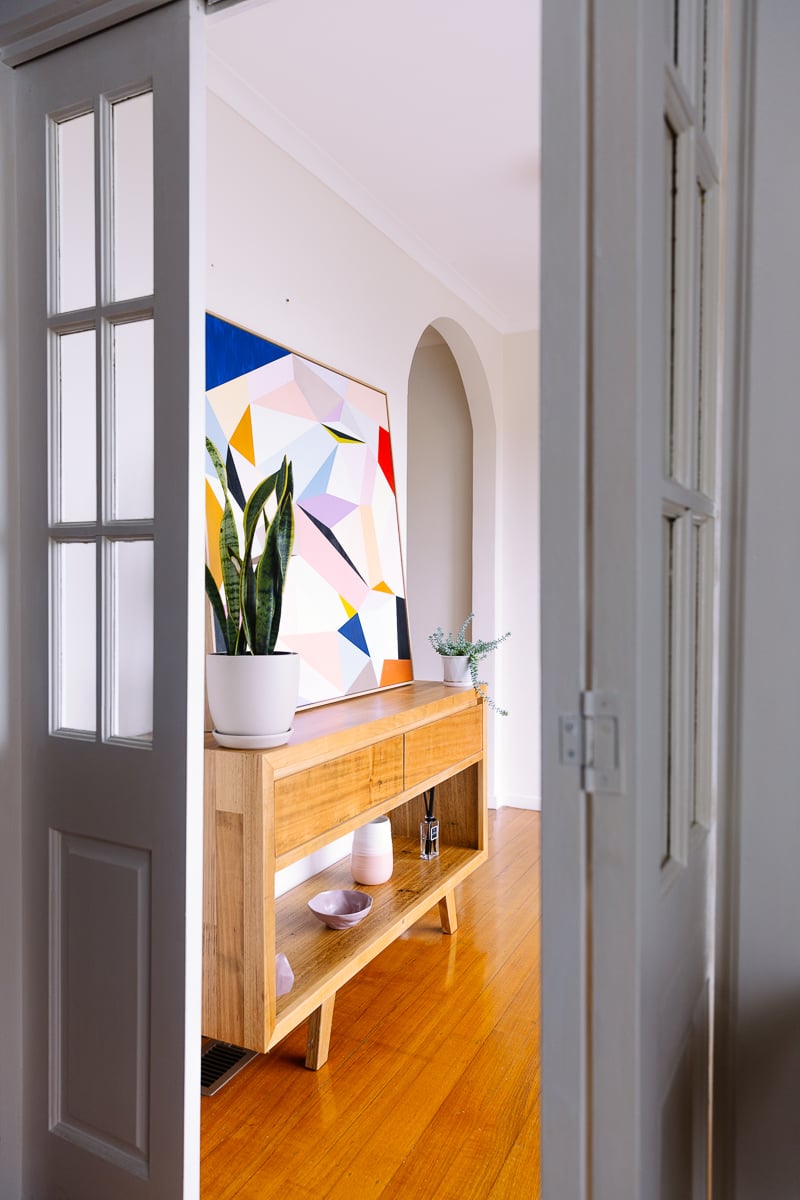
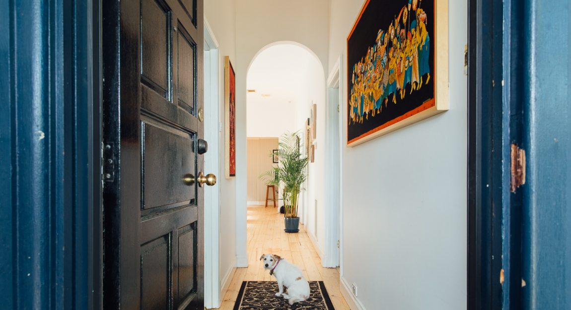
The front door literally opens onto this small entryway – and what a first impression! The dramatic angles of the snake plant harmonise perfectly with Susie Monte‘s geometric abstract. Note how the vase below matches the colours of the triangles in the painting.
4. Finish with a bang
Let the hallway lead to somewhere exciting with a dramatic piece of art at the end. Not all hallways lead into other rooms – some just lead straight into a wall. Choose a large, bold piece to finish it off with dramatic flair and make a statement. We love ending with an escapist artwork – gorgeous travel landscapes, lush oases or sunny shores.
5. Keep it simple
The age old adage has never been truer! Don’t overcomplicate the space and risk it feeling cluttered. Pick your key feature and maintain that as the focal point. Make sure you’ve left enough room to move through the space – after all, that’s what a hallway is for.
Create a pathway between art and tables by alternating where they’re positioned within the space. Using both walls will maintain a sense of balance – instead of having one wall heavy with detail.
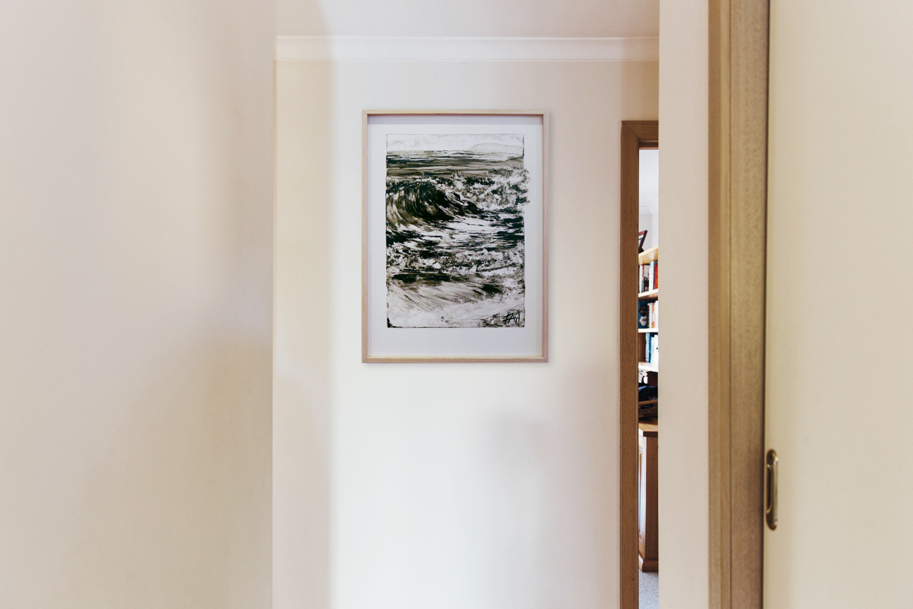
Simplicity is key with this monochrome hallway wall art, which is finished off with Angel’s Shorebreak by Fredrick Wales.
However, you don’t have to go full minimalist for simplicity to work – this rule is all about proportion. The old adage says less is more – but maximalism is making a comeback! Instead keep it functional and true to you.
Get inspired with our handy curation of large pieces perfect for hallways here.

