5 Trends to Inspire Your Collection in 2018
We’re only a few days into 2018, and already it promises to be a huge year for art and design. To help you get inspired, we’ve uncovered five of this year’s biggest interior trends and a few stunning pieces that really bring them to life.
1. Pantone’s Colour of the Year
The secret is out, and Pantone’s colour of the year for 2018 is 18-3838 Ultra Violet, a stunning blue-based purple reminiscent of unknown galaxies, new technology, artistic expression and spiritual reflection. In the words of Leatrice Eiseman, Pantone’s executive director, “intuitive Ultra Violet lights the way for what is to come.” Why not embrace the possibilities in your home?
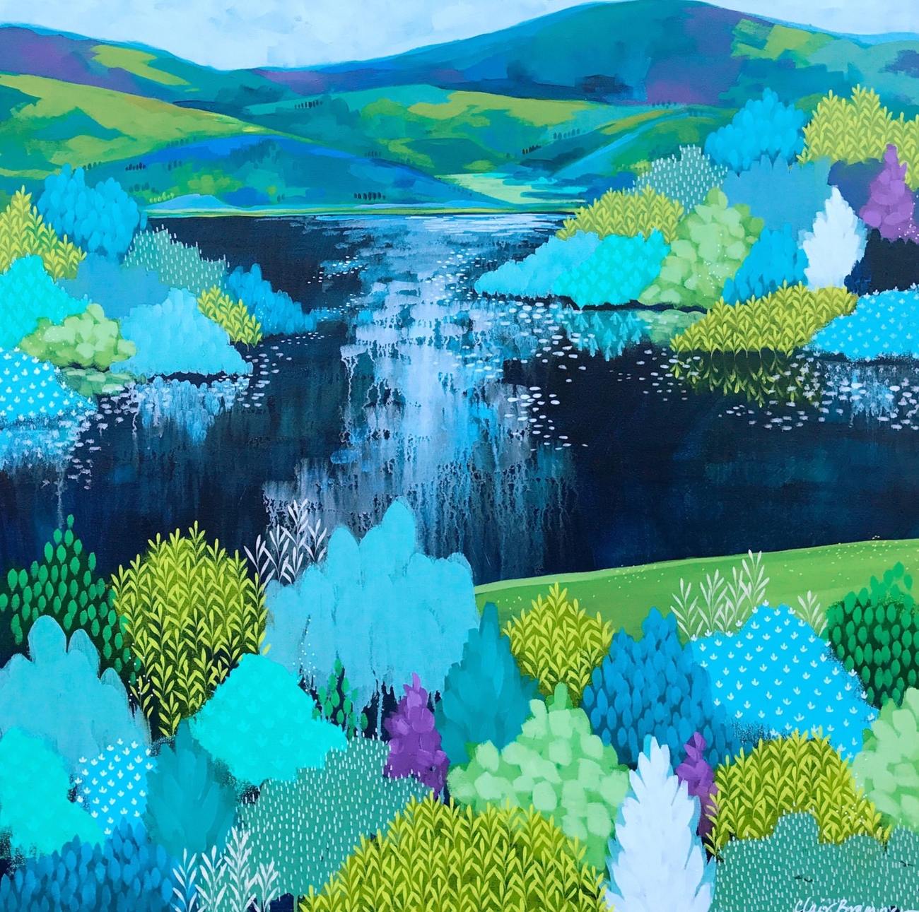
An Afternoon Walk by Clair Bremner. The subtle pops of purple really elevate the piece.
Our curator Laura McLean has a couple of suggestions for pieces that really let the colour shine through. “The vivid purple of Ultra Violet brings an otherworldiness to landscapes by Clair Bremner such as An Afternoon Walk, which is stunningly set in a palette of ‘jewel tones’. It also lifts the blues of Henny van den Wildenberg’s lush abstract Evening Indigo into the ether.”

Evening Indigo by Henny van den Wildenberg. Intoxicating!
2. Metallic Features
Shiny metallic features are back in full force this year, and in the midst of changing favour, mixed metals is particularly popular. According to leading futurist Victoria Redshaw from London trend forecasting agency Scarlet Opus, “Copper has been hugely popular for more than five years but it has reached its peak and brass is now the metallic of the moment. We are predicting the eventual return to favour of silver metallics, look out for this starting next year.”
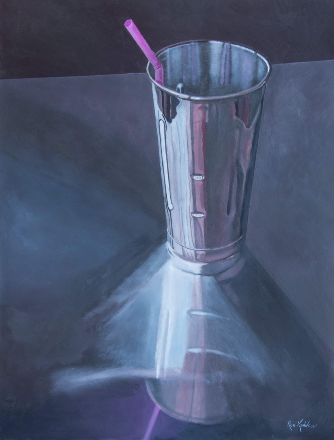
Milkshake Cup by Rob Kennedy celebrates an unmistakable cafe icon.
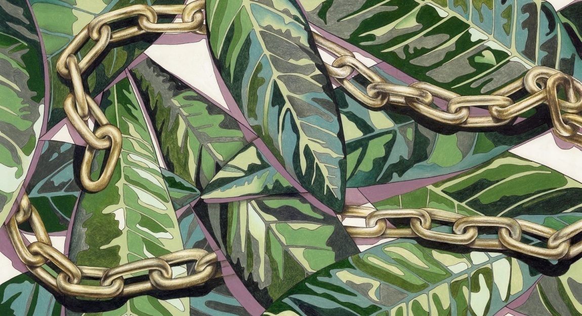
Luckily, Bluethumb has some stunning artworks in the metallic vein. Whether you choose a clever metallic illusion, such as Milkshake by Rob Kennedy, above, or actual gold leaf, such as Marnie McKnight’s Aspen below, flashes of silver and gold catch the eye and add a fun, textural element to any room.
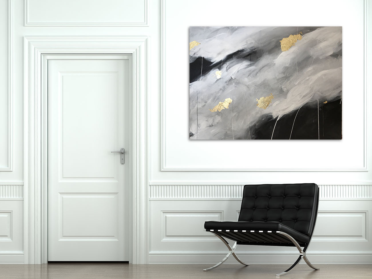
Aspen by Marnie McKnight. We love how the gold in the painting contrasts with the silver on the chair and door.
3. Intellectual/Preppy Classic
Deep thought and intellectual pursuit have never been more important; one need only look to the burgeoning ‘intellectual’ trend forecast by the Donegan Group for widespread recognition of this requirement. The intellectual, preppy vibe is enjoying a resurgence; it’s all about creating the feel of an old school library in the most unexpected of places.
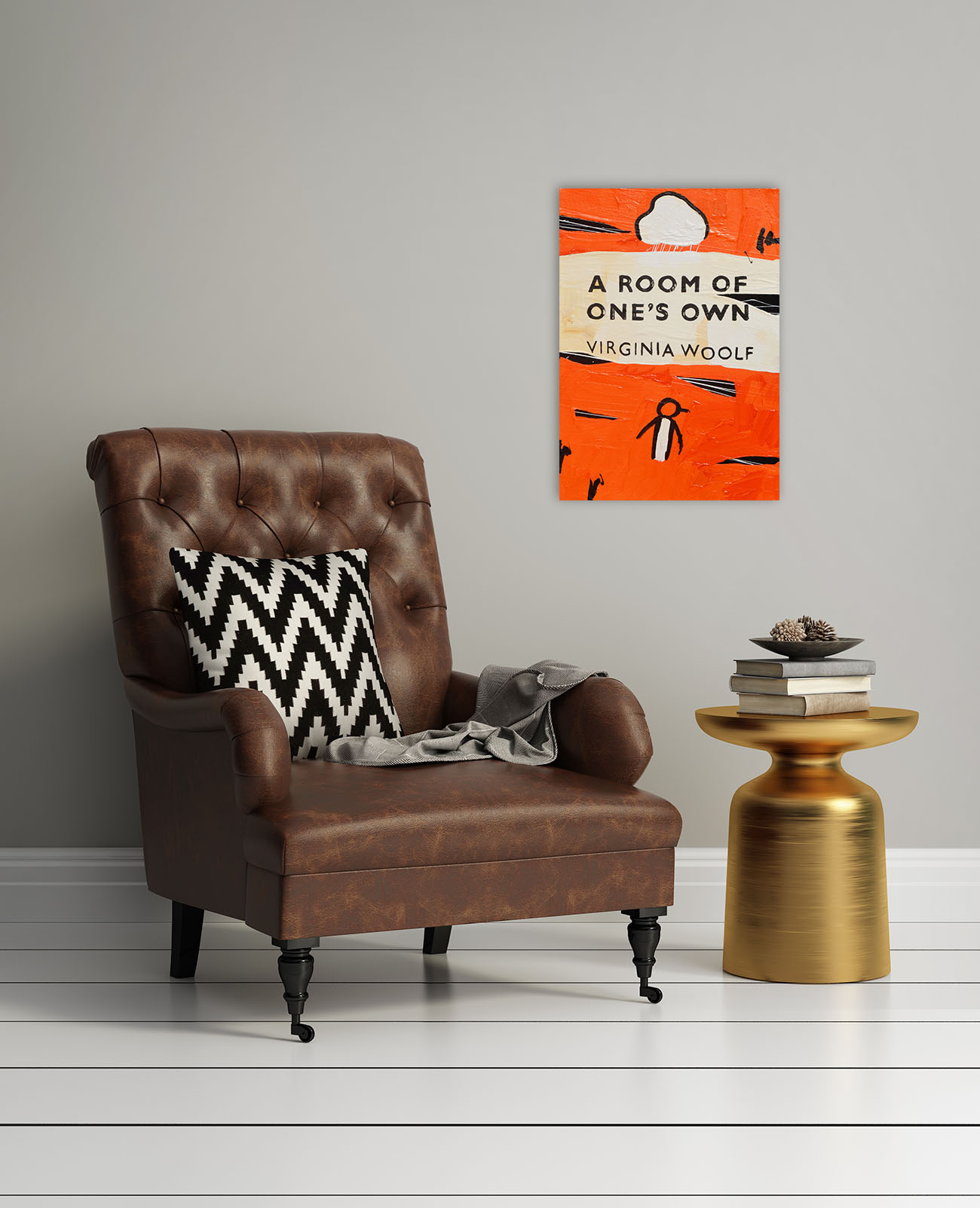
The perfect reading corner! Unpopular Penguin 216 by Ben Tankard.
According to Laura, “for the trend of cosy, ‘intellectual’ interiors, where paper and real books are championed, Bluethumb favourite Ben Tankard’s ‘Unpopular Penguins,’ based on covers of Penguin classics, fit the bill perfectly. For the young or the young at heart, works by Sherry McCourt such as Wondering Alice, inspired by Lewis Carroll’s ‘Alice in Wonderland’, recall imagined worlds and stories shared.”
4. Sage, Celery and Avocado Green
In contrast to Pantone’s colour of the year for 2017, the lime-green ‘Greenery’, this year will see explorations into other shades of green, predicts the Paint Quality Institute. In particular, more muted, timeless and natural shades are forecast, such as sage, celery and avocado green.
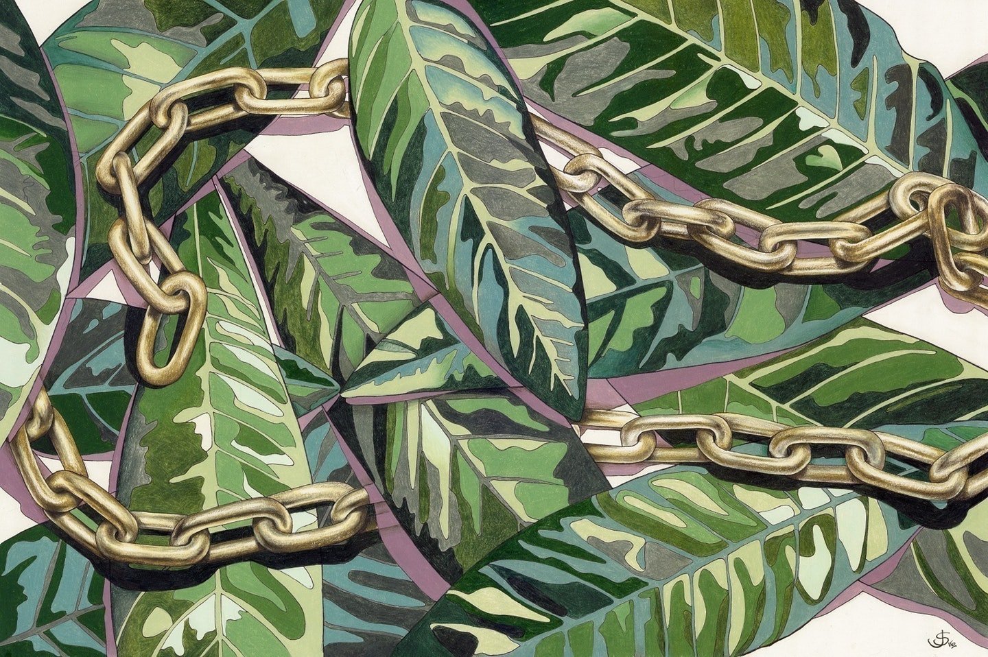
This piece by Jane Stradwick, Laurels – Rose Gold, also touches on the metallics trend.
Given the colour scheme’s soft, soothing ambience, it’s easy to see why the appeal! A couple of pieces we love are Laurels – Rose Gold by Jane Stradwick, above, and Chris Martin’s portrait of his eldest daughter, Molly, below.
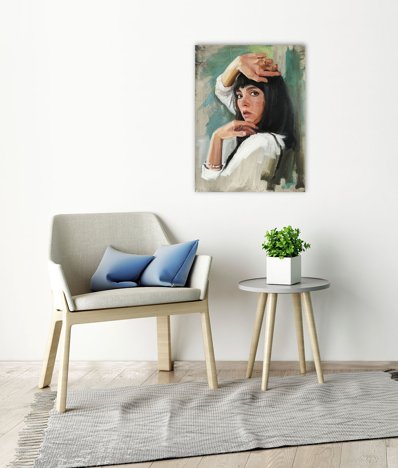
Molly by Chris Martin. This piece would also be a lovely example of Wabi Sabi design. Read more about it below!
5. Wabi Sabi
One trend set to spread like wildfire in 2018 is the idea of finding beauty in imperfection, inspired by the ancient Japanese philosophy of Wabi Sabi, according to Scarlet Opus’s Victoria Redshaw. Elements relating to Wabi Sabi become more intriguing and attractive through years of use, wear and care, gathering layers and stories as time goes on.
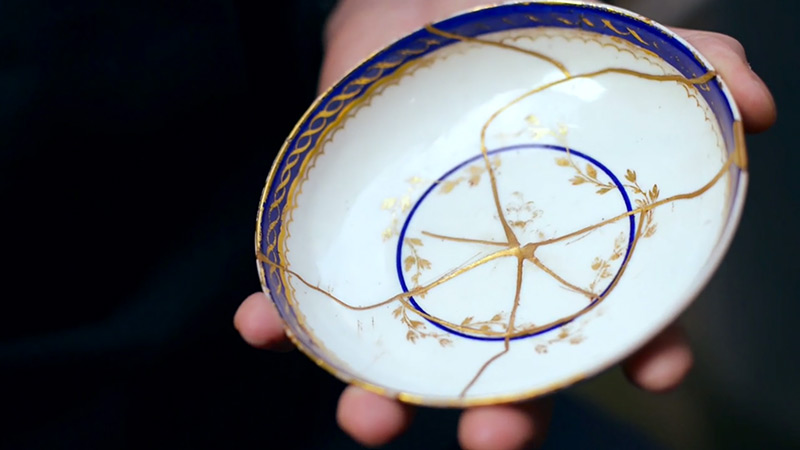
Kintsugi, the Japanese art of mending broken things with gold, is a perfect illustration of Wabi Sabi at work. Source: Colossal.
Pieces that hint at the stunning messiness of life are the perfect way to capture the Wabi Sabi philosophy through art. Anything that blurs the line between figurative and abstract will help accomplish a laid-back and timeless atmosphere in your space. This piece, for example, by Julie Hutchings, is drawn from life, and has a sense of grounded vibrancy and life-like rhythm.
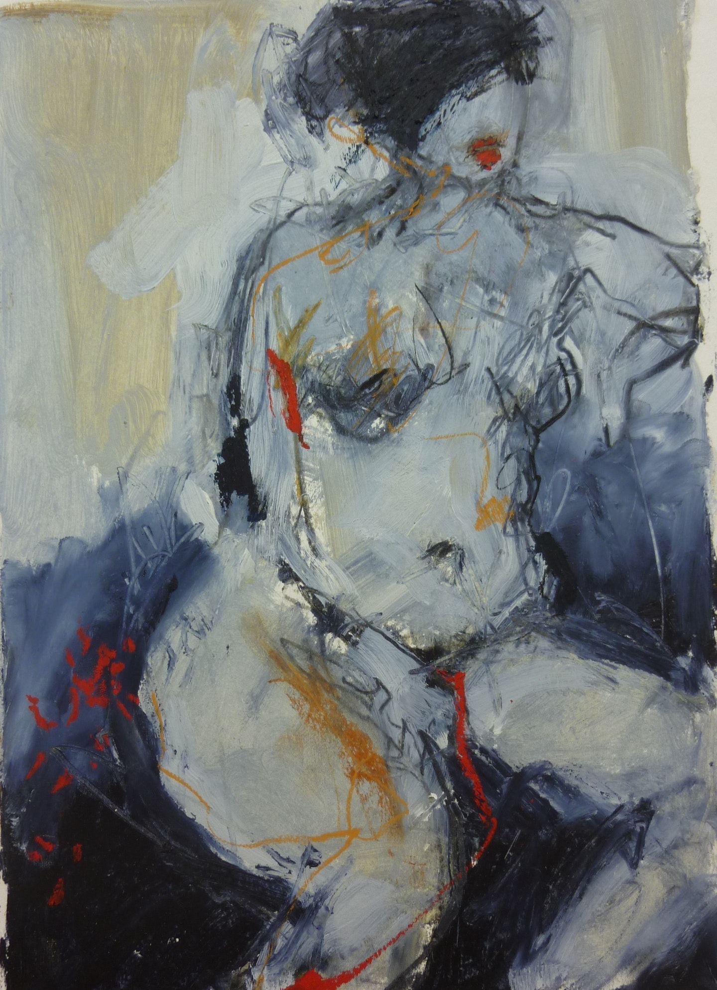
Indolence 1 by Julie Hutchings; the perfect piece for a lived-in home.





Love the tips and works