Our Brand New Look
Have you noticed anything different about the Bluethumb site lately? We’ve got a brand new look and some awesome new features.
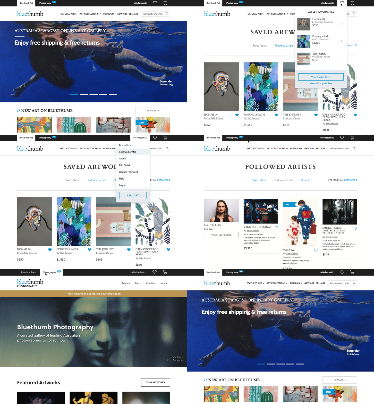
More specifically, our user experience team has redesigned the top menu bar of the website, switching the blue for a chic black and giving users easier access to important pages like their favourites, cart and dashboard. This might not sound like a big deal, but we’re hoping it will make a significant difference to both collectors and artists.
Melissa Cooper, Head of Product and User Experience, explains the changes. “Knowledge is power, and we’ve made it easier for collectors to favourite works they like. On the flip side, we’ve also made it easier for artists to view that feedback and see what artworks are the most popular at a glance.”
For Collectors
As Melissa says, “Our new global navigation is intended to make the most important features on Bluethumb more accessible for our customers. The biggest benefit for collectors is how easy it is to to save and manage favourite artwork, so you can create shortlist of works that catch your eye.”
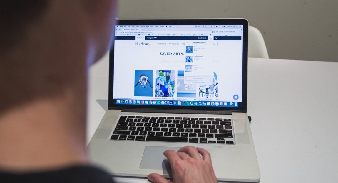
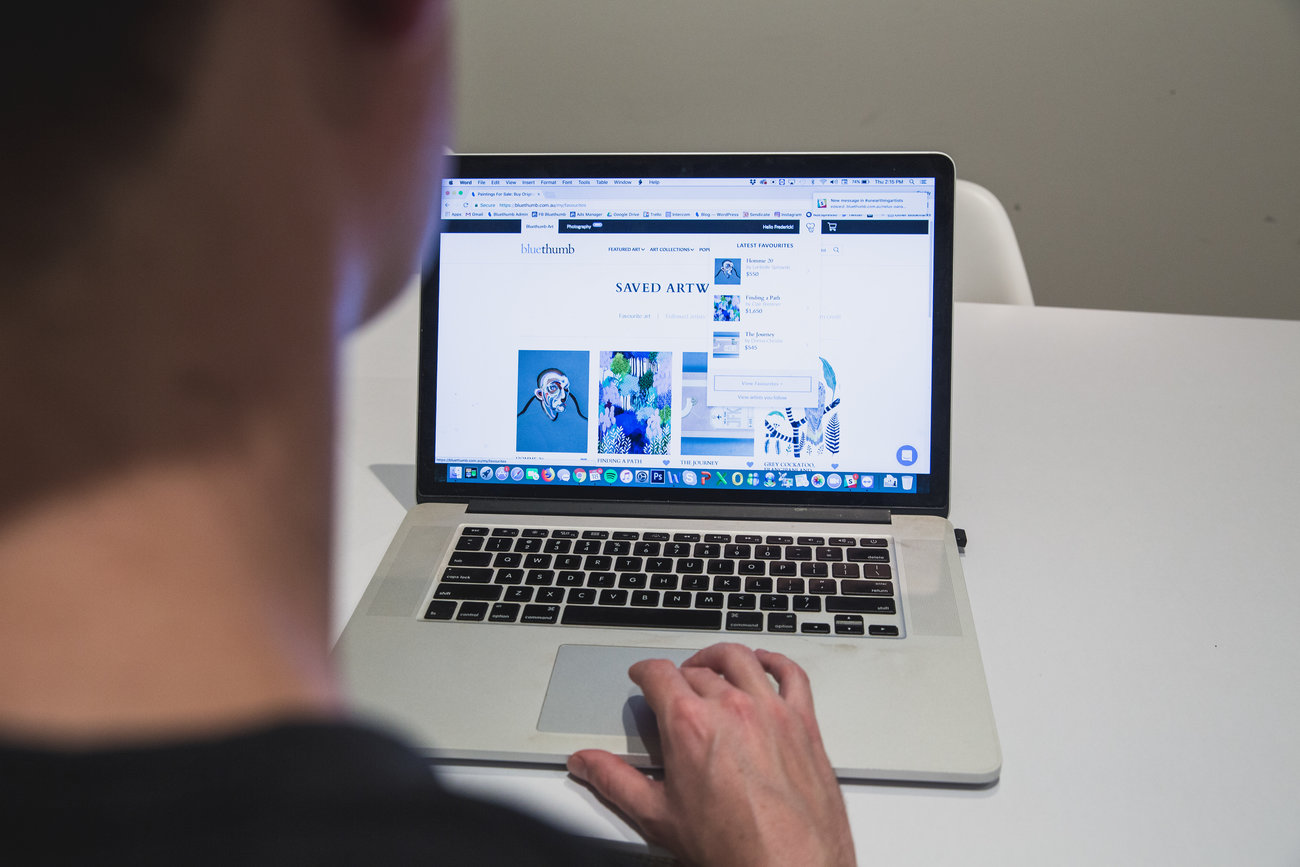
We’ve added a button leading to one’s favourites and cart within easy access on that top navigation bar. Now, it’s easier to see all your favourites in one place and to unfavourite those you’re no longer in love with.
If you don’t have an account with Bluethumb yet, you’ll now also receive a few suggestions for top selling, highly favourited artists. We’re pretty sure you’ll find something in there to get your list of favourites started!
Finally, we’ve made it easier to access Bluethumb Photography. We’ve worked hard to create an incredible online platform for Australian photographers, and we want our collectors to come to know and love Bluethumb Photography as much as they love the main Bluethumb Art site.
For Artists
“Of course, anything we make easier for our collectors, is a benefit to artists too,” says Melissa. “Better functionality means more views, favourites and sales.”
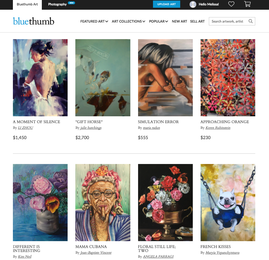
That said, we’ve also added some specific features just for artists. For one thing, the option to upload art is clearly visible in the global navigation bar. “We wanted to make uploading art and managing your account from anywhere on the site more visible and intuitive than it was before,” she explains.
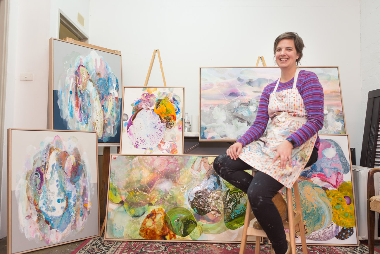
“Anything we make easier for our collectors, is a benefit to artists too,” says UX head Melissa Cooper.
In addition, artists can now see their overall views, follows and favourites for their profile and artworks. “On artists’ dashboard,” explains Melissa, “under the Artist Overview, we have a summary of views, follows and favourites. This enables the artist to see those tallies go up as they gain more exposure. On the My Artwork page artists are also able to see the views and favourites that they have accumulated for each individual artwork.”

