How to Choose Art like an Interior Designer
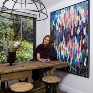
There’s nothing quite like the feeling of buying an artwork you love, but finding that perfect piece on cue can be difficult. At Bluethumb we believe the process of buying art should be easy and enjoyable, even if there’s a time pressure or you’re in the middle of a stressful move. Our in-house interior designer, Alex, has years of experience working with both homeowners and designers, meeting strict deadlines and bringing complex briefs to life. Her portfolio of happy clients, including large design firms like Fulton Trotter, speaks for itself (and could include you as our art advisory service is absolutely free)! It also makes Alex the ideal person to advise on choosing art for any space. Take these five golden rules from an expert in the field and give your space the interior designer look!
Interior Designer Rule 1: Use Your Space Wisely
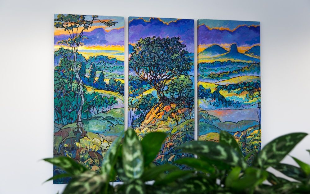
“This is probably the first and foremost step to finding that ideal artwork for your home,” Alex highlights. “When a company or client comes to us with a brief, knowing the size of the space, the decor and furniture allows us to start thinking about what scale we’re looking at.” For example, consider if a large painting will cramp up your space. Would a small A5-sized print get lost in the breadth of a lounge wall? There is a place for every piece, and a piece for every place. “Knowing the size of the space you’re working with also feeds into all the other decisions you make with the artwork, such as colour and style.” Once you’ve decided on the artwork, the importance of hanging it properly cannot be overstated (read our blog about how to hang art here).
A triptych by Wayne Smith fills this space perfectly.
Interior Designer Rule 2: Be Subtle When Matching Colours
“People often go in choosing art thinking that the dominant colour of the room needs to match the dominant colour of the artwork,” Alex says. “A tip from the pros is that it’s much better to complement hints of colours in a piece of art with the space.” If your decor uses a lot of pastel pinks, for instance, choosing an abstract with a dash of pinky hues will be just enough to encourage a sense of cohesion in the space. “Another effective way of choosing a colour palette for a piece is by contrasting tones with the room’s decor. If your furniture is grey, instead of just going grey, grey, grey, choose a bright or bold hue that will pop against your decor.”
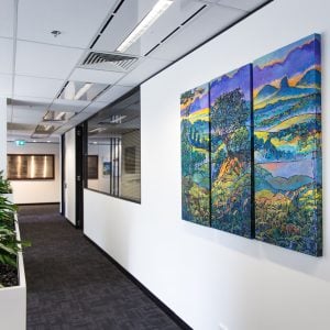
A subtle touch of olive in this Hayley Kruger masterpiece works beautifully with the furnishings in this room.
Interior Designer Rule 3: Use Series and Cohesive Groups
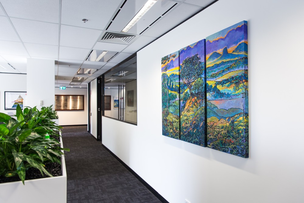
Why stop at one artwork? Having a series of art throughout a space or creating a gallery wall can deliver impact and give a polished, professional look, even in more restricted areas. “A recent project we took on included corridors throughout an aged care facility. In these kinds of areas with a lot of length and not a great deal of width, a series is a perfect solution to the size issue. There are plenty of ways to create a common theme between the artworks, too – we’ve seen gallery walls created from the same artist, similar size works, similar subject matter or the same art style tying the series together.”
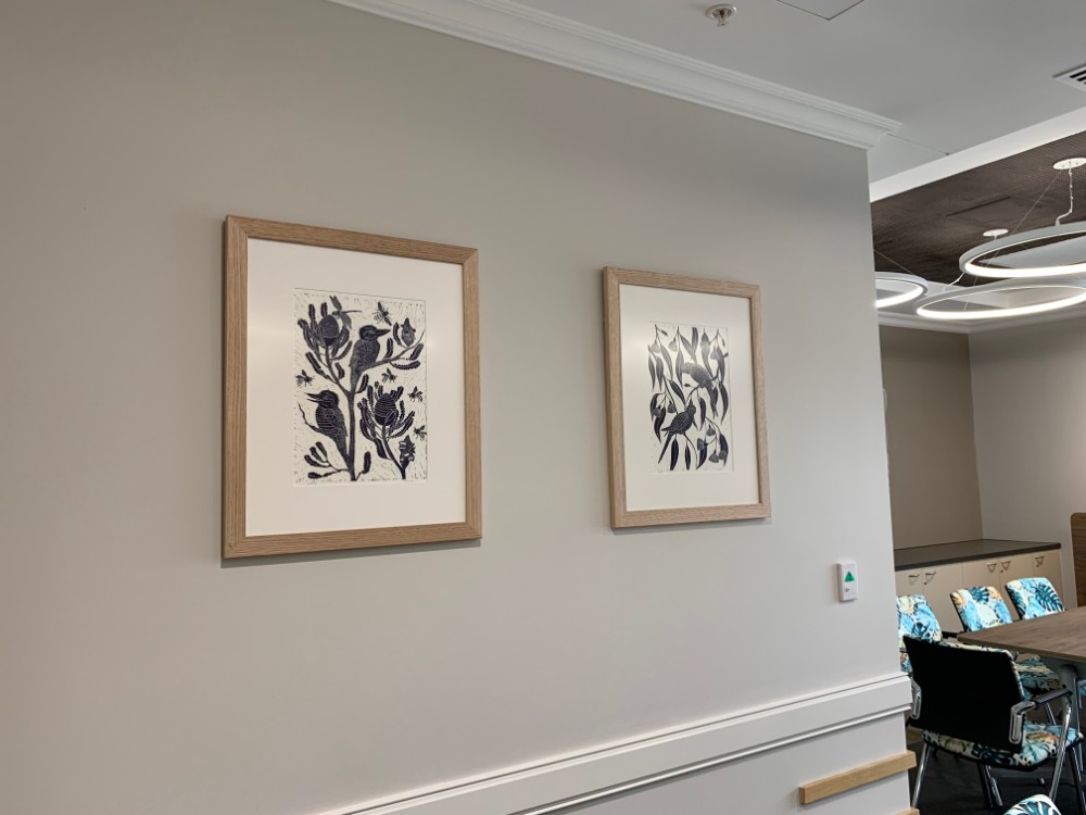
A series of prints by Marinka Parnham brings this corridor to life.
Interior Designer Rule 4: Nurture the Personality of a Space
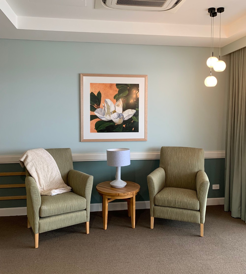
Think about what you’ll be using this space for and take the opportunity to set the tone of a room with the art you choose. Creating cohesion between your art and your home is key to finding that ideal artwork. A peaceful abstract, for instance, can promote serenity throughout a central living room. Similarly, watercolour paintings are more likely to soften a space, whereas oil paintings with thick textures can energise the atmosphere in a room. “Both residential and commercial projects I’ve worked on have been centred on the energy the client needs in that space,” Alex explains. “How can we nurture the personality of that room? That’s the question we always need to consider. If we’re looking at art for a client’s kitchen, for instance, a warm-toned still-life of fruit is a perfect match. If it’s an office space, opt for energising cityscapes or calming beach scenery.”
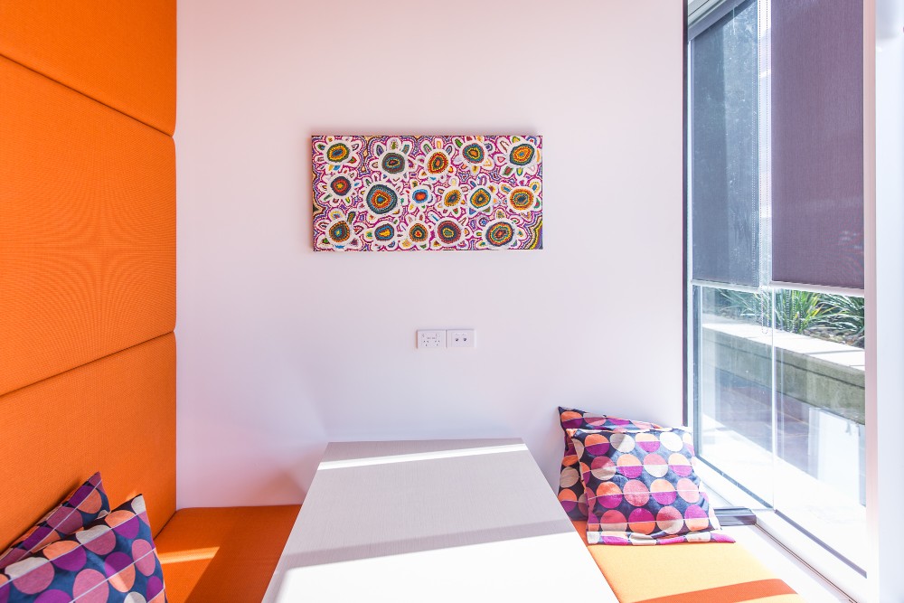
Samuel Miller adds energy to this office’s meeting booth.
How about letting your location lead your decision? “Clients will often request starting a project at home before moving further afield,” Alex says. “A recent example of this was a large-scale project that took place in Sydney. We started by looking at iconic scenes of Sydney and work by Sydney-based artists, then gradually spread out to neighbouring areas. Choosing artwork influenced by location is an approach taken by both residential and commercial clients, since it’s such a fruitful way of reminding people of the unique place they are in.”
Interior Designer Rule 5: Get the Commissioned Look… by Commissioning for Free!
How many times do we see things that are almost perfect, but are just missing one small detail? Maybe the size isn’t right, or the colour isn’t quite what we’re looking for. It’s easy to get that piece for you by commissioning an artwork. “There’s a lot of misconceptions about getting a piece commissioned and many see commissions as a daunting, perhaps expensive way to buy art,” Alex explains. “It’s actually the best way to customise your piece, especially for you. On top of that, Bluethumb arranges commissions at no extra charge, so there’s really no reason why you can’t find that dream piece after all!”
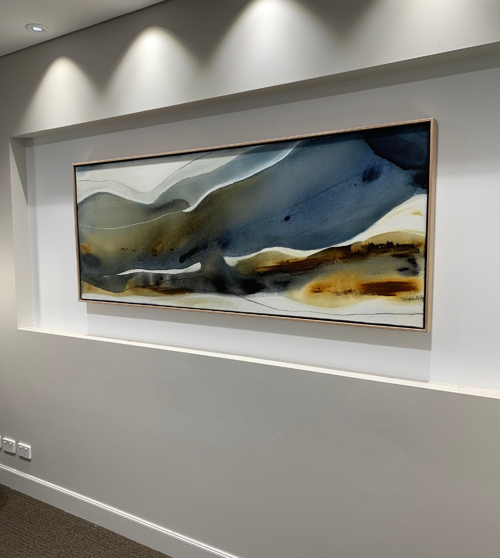
Made to measure! Dinah Wakefield‘s commissioned work couldn’t fit better in this space.
Feeling inspired, but don’t know where to start choosing art? Get in touch with the team for your free art advisory service or check out Alex’s latest designer picks here!


You provided some really insightful tips. I particularly appreciated your point about considering the scale of the artwork in relation to the space. It’s easy to overlook how important that is for achieving harmony in a room. One thing I’d be curious to hear more about is how you suggest balancing personal taste with professional design principles. Sometimes, what we love might not always align with the ‘rules’ of design, so finding that sweet spot seems like a real art in itself!